Interview: Mike Migurski
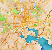
Mike Migurski is partner and Director of Technology at Stamen design studio in San Francisco. He and his Stamen colleagues recently unveiled a new site, maps.stamen.com, that included three custom-rendered maps using data from OpenStreetMap, including a remarkable one that, despite being generated by algorithm from precise vector data, resembled a hand-made watercolor painting.
- Paul Smith
-
You’ve blogged about the process of creating the Terrain map tiles, and the code for the Toner tiles is open-sourced and on GitHub, but the Watercolor tiles seemed to come out of the blue. Can you talk about what inspired them, how you and your Stamen colleagues went about designing them, and what uses you imagined for them?
- Mike Migurski
-
The main use we imagined for them was that they would look really, really good, and unlike anything else being done with online maps. The process started with Eric Rodenbeck and Zach Watson kicking around some ideas on simulating the appearance of watercolor painting algorithmically, and expanded to include Geraldine Sarmiento’s hand-done textures.
We saw an amazing reaction to Aaron Straup Cope’s work on Prettymaps last year, and more generally a lot of interest in map-based art, so it seemed natural to try something that was algorithmic and at the same time had the appearance of being made by hand. I figured people would swallow their tongues in surprise when they saw these, especially when we switched from image search results for painted textures to pictures we were making ourselves for the project.
- PS
-
Making maps these days is often about mechanizing the conversion of vector data, like from OSM, into raster images, which has meant perfecting our ability to layer and style points, lines, and polygons in very precise ways. I think what captivated people about the Watercolor tiles is that they seemed to color outside the lines, so to speak, in a way that didn’t seem possible with current tools. What tools did you use to generate the tiles, and how did you engineer them in a way to achieve this effect? Did you have to write new software to aid you?
- MM
-
We did write new software, yes. We’ve been exploring ways to make OSM data more usable by cartographers over the past few years, and that’s largely been expressed in code designed to make large data sets easier for cartographers (and ourselves) to deal with:
- Cascadenik was the first widespread application of CSS-like style rules in this area, since developed and expanded by Development Seed in Carto.
- TileStache is a tile-generation server built to deploy custom visualization and rendering code.
I’ve been talking about this stuff for a few years, and the release of maps.stamen.com is intended to be a showcase that helps shift expectations of what good, online cartography should look like. It hasn’t been long since using a solid anti-aliased vector-rendering library like Mapnik was enough to make a strong showing against commercial map providers, but now we’re starting to establish new ideas around texture, color and labeling that require a layer of additional work beyond Mapnik.
Watercolor itself is a custom Provider to TileStache, feeding on simple Mapnik output and adding techniques like gaussian blur and Perlin noise as well as high-quality scans of actual water color paintings to achieve its effect. The development of watercolor had a number of stages, beginning with Zach’s experiments in noise and texture, Eric and George Oates’s encouragement, Geraldine’s addition of color and texture, and proceeding to my work with Jeff Easter and Nathaniel Kelso to improve performance until the code was good enough for public launch. The visual appearance is ridiculously CPU-hungry compared to your typical vector cartography, so we’ve got a few virtual servers on the moon doing the live calculation of new maps in new places.
Without diving too deeply into the actual watercolor code, we owe a lot to Kai Krause’s Algorithmic Painting ideas from almost 20 years ago.
- PS
-
I see that Stamen is releasing these tiles under a Creative Commons license as part of a Knight Foundation-funded project centered around data visualization and cities. City governments are historically big users of enterprise GIS software like ArcGIS; are there any lessons here for government or citizens, or does the work, specifically the Watercolor tiles, speak for themselves as art?
- MM
-
I think the latter: watercolor is basically art. Of course there’s an undeniable political component to the OpenStreetMap data it’s made of. In the U.S. OSM Foundation we’re interested in ways to get government at various levels to participate custodians of OSM, and I think open data and enterprise GIS software can cooperate. Esri puts a lot of effort into OpenStreetMap-related efforts, and I’m not expecting to see their involvement in city governments wane.
- PS
-
Can you expand a bit on the interplay of vector data, raster data, and image filters to produce the tiles? What sort of preliminary work did you need to do to get the components parts to fall into place? Do you see patterns emerging and opportunities for abstraction for future artist map tools?
- MM
-
I probably can’t explain as well as Zach just did.
As a bystander to this part of the process, it seemed like the actual simulation technique took shape in just a few days, based on Zach’s existing experience with image manipulation in Python. The real work came in the knob-twiddling, or as we call it internally, “spring tuning” (based on our experience with the Digg Swarm project from 2007). Here, for example, is one of Zach’s own parameter views that he used to tune noise thresholds for the ground texture.
I think the pattern that’s emerging for me is the raw labor-intensivity of this kind of work, the parameter-tweaking in a space of possible outcomes that results in something that looks right and feels exciting. Once the basic structure of noise, blur and threshold is in place, all you can really do is watch carefully as you repeatedly try combinations until something clicks.
- PS
-
We’re usually talking about algorithms and stylesheets when we talk about web maps. Traditional cartographers often exercise artistic license over data streams as well—for example, manually but subtlety tweaking the curve of a road so that it reflects a shared or colloquial understanding of its location rather than it’s literal location. And then there are the more abstract but functional examples like subway system maps, whose stops and lines are not intended to be scale representations of their real-world counterparts. Do you see it possible for automated cartography to produce maps like these? What techniques would we need to develop (for example, a “hints” file ala typography for manually overriding certain points)?
- MM
-
I’ve not yet seen an attempt at automating this kind of cartography which has resulted in a satisfying outcome, but it’s still the subject of many PhD theses, so maybe it’s just too early. I suspect that we’ll end up seeing is a companion project to OSM where human make decisions about how things should be shown and contribute those to a free and open data source. Everything is still so manual in this world, and the subject of most maps doesn’t move around all that much, so you can really apply a human eye to get it right. Even with the watercolors, we had to do a lot of manual work to ensure that the 1024×1024 watercolor texture blended cleanly and the various road sizes looked correct at each zoom level.
- PS
-
Regarding deployment. One of the challenges of producing raster map tiles for the web is the amount of storage and CPU time it takes to generate them; I notice that Stamen’s tiles are available down to zoom 18, which for a worldwide set means there are millions and millions of individual PNG files. To a degree CPU time can be amortized over the life of the project if you’re using a tile server to dynamically generate and cache tiles as users first request them, but even with commodity storage like S3, you’re talking about hundreds of GB or more. Are there knock-on challenges this presents for deployment and maintenance? Is there a sustainability plan for maps.stamen.com with regard to storage and bandwidth costs, or is Stamen as a company just going to eat those costs to provide this resource?
- MM
-
We’re using a mix of physical and virtual machines for each of the tile sets we just released, blending the strengths and weaknesses of each. The CPU-intensive rendering of watercolor maps is done on Amazon EC2 where we can invoke extra machines as necessary, but the PostGIS, Mapnik and cache storage parts are all living on an actual server in a colocation facility. We decided last year to invest in physical hardware to take advantage of the high random-access speed of solid state disks, which make it possible to serve the entire OpenStreetMap planet database without incurring the overhead of Amazon’s terribly slow I/O speeds.
Fortunately, the back-end of this project is used to drive a lot of our other work, so we’re folding the cost into a series of different engagements that all use different components of the map tiles.
- PS
-
We appear to be reaching a tipping point where rolling your own custom map stack seems not only practical but desirable for many applications. What is your reaction to the embrace of OSM by prominent technology companies, and the emergence of designer-friendly tools like TileMill? Do we have everything we need for most designers and developers to create the map experiences they want to provide? What tools would you’d like to see built; what data sets made available?
- MM
-
Honestly, I’m completely thrilled. With this year’s high-profile addition of Foursquare and Apple to the OpenStreetMap community, I’m looking forward to seeing what new artists and designers decide to do with maps—I can’t wait for the U.S. State Of The Map conference this autumn.
I think there are two issues that current tools don’t address well enough, and I’m excited to be working on them both: medium-scale data for counties and towns, and more options for bitmap filtering and output. I want Photoshop and Illustrator in the sky, essentially, and tools like TileMill help expose places where we need to be doing more with data before rendering and more with pixels after rendering.
- PS
-
Elaborate on what you mean by “medium-scale data”, and how it would improve map-making.
- MM
-
My colleague Nathaniel Kelso runs a project called Natural Earth Data, which offers global vector data at three different scales, optimized for rendering images of large regions, countries and continents, up to about zoom=9 if you think in terms of web slippy maps. OpenStreetMap meanwhile offers small-scale data down to the level of individual carriageways on major streets. There’s a gap between these two data sets where OSM is too detailed and Natural Earth is not detailed enough, so on many renderings you get bizarre selections of town names to render, doubled-up street names, or no global context.
The Terrain layer on maps.stamen.com is a vehicle for exploring a few avenues through this problem: feature generalization for route shields and large street names using the Skeletron library, simulated annealing for smarter label placement with Dymo, and cross-blending of raster data sets for ground cover and hill shading. We’re doing a lot of work to make OSM data better for rendering, and releasing all the component parts as software for processing data sets.
- PS
-
Do you see Mapnik as the appropriate place to grow the bitmap filtering and output functions?
- MM
-
As far as Mapnik’s role in all this, I think it’s the single best place to do vector rendering, but I’m looking elsewhere for filtering and output. I prefer to use tools that are specialized for individual tasks, so we use the pixel output of Mapnik as a source for Python-based pixel manipulation code, often implemented in libraries like NumPy that offer rapid manipulation of bitmap arrays.
- PS
-
It sounds like you’re hinting at a new program for this kind of manipulation. You and Stamen have contributed a great deal of open-source map making software over the years; will the code that created Watercolors be released?
- MM
-
I hope I’m not sounding too coy; there’s not any secret piece of software running the show, just a set of well-known techniques in a new arrangement. I’ve released everything I’ve ever started, but my role in Watercolor was more about taking something that already worked and making it work a little better so more people could see it.
- PS
-
Most web maps are a pre-baked set of raster images assembled in the viewport of the browser—do you see this fundamental arrangement changing in the foreseeable future? With WebGL and HTML5 Canvas, are we ready to composite maps client-side with servers pushing vectors data over the wire? What tradeoffs are there here? Do you think you could do Watercolors entirely in the browser anytime soon?
- MM
-
I don’t think we’re far off, though there are a few impediments still in the way. Much of the core functionality of Watercolor’s bitmap effects can be implemented entirely on a GPU in a WebGL fragment shader, so there’s no reason that we couldn’t build it that way. As far as shipping vectors, I’d love to see it happen. It’s actually not unrelated to the work we’re doing with differently-scaled data: you want your underlying data to be at the “right” level of complexity, and that generally means modifying it in some way, by dropping extra points, scrunching narrow polygons into lines, making small things disappear, and lumping groups of things together into single blobs. If we can figure out a better way to simplify on the fly, then complete client-side rendering could be a reality. Of course, Google has already done a lot of this themselves, but it’s different when the open source community does it and shares the results and the research.
- PS
-
Simplification of lines and polygons is a common need for mapping projects, not only for display but also for interaction—clients can only handle so many points during the refresh cycle. It can be a big challenge for workflows to simplify vectors, and also to preserve topology, the relationship between shapes—our model is of disconnected points, lines, and polygons. That’s one reason I’m excited about topology as a type coming in PostGIS 2.0. What simplification techniques should we be using and exploring, both on the algorithm side as well as the workflow side?
- MM
-
I spent about two years (off and on) researching line generalization. Skeletron went through three iterations, starting with a port of the straight skeleton technique from Tom Kelly’s description, to a collaboration with Schuyler Erle binding to the CGAL library from Python, finally settling on an application of the Voronoi diagram first published by Esri in 1996. All the way through, I kept thinking that there just had to be an easier way to make simple lines out of complex ones, and why wasn’t I finding code to do it for me? The simplification techniques we should explore are all known and published, but exist largely as plugins for systems like ArcGIS, instead of chainable tools in the Unix style. PostGIS 2.0 is going to help in a big way, and I hope that some of that effort migrates out to tools for managing workflows around flat files.
If all goes well, it should start to make sense to ship vectors over the wire and render them on the client.
It’s an interesting question to me whether client-side rendering really something we want to aim for, though. Bitmap tiles have an equilibrium of performance, size and design that I don’t think will be disturbed any time soon. I’m learning what I can about GPUs to be ready when the day comes, but in the meantime most of my focus is on developing workflows for data. OSM extracts are one aspect of this; simplifying OSM data and standing up fresh new rendering databases from source data is another. The scaffolding that makes life easiest is a combination of bias toward flat files and Postel’s Law: don’t screw around with “seamless” servers, publish data flat using old file formats, and only invent brand new things when they’re needed. Spherical Mercator slippy map tiles are fast becoming one of those well-understood old file formats, so this is what we’ve aimed for with Watercolor; otherwise, how could we have a section on maps.stamen.com showing how to use the imagery in your own applications?
- PS
-
That’s interesting—so are you generally fine with the way Spherical Mercator has colonized the web map world? It seems to have been a decision purely about tradeoffs: what projection “works” for world-wide maps all the way down to zoom level 22, or however detailed Google Maps gets these days. But clearly choice of projection is a never-ending debate. Is Spherical Mercator an acceptable enough constraint, from your perspective, within which to do the kind of artistic expression Stamen does, and maintain interoperability?
- MM
-
Oh yeah, I’m absolutely fine with it. It’s one of those “assume a spherical chicken” engineering solutions that actually leads to so much follow-on innovation that in retrospect I’m glad no one was letting the cartographers drive at Google in 2005. Projections only matter when you’re looking at large areas, and that’s really not the case when you’re searching for driving directions or checking out the neighborhood where you spent elementary school. It’s interesting to me, though, that the typical fifty states map you see on every link bait infographic out there is based on a conic projection—it’s about what looks right for a genre of mapmaking, and in the case of slippy maps the Spherical Mercator is clearly the obvious choice.